TOMATO_Case Study_Posters_03 copy.jpg
 
TOMATO_Build_up_02.gif

Tomatopay - The fairer way to pay

Tomatopay is a new, QR-based digital payment solution that supports local businesses and their customers. Their low fees and fast payment transfers allow businesses to manage and access their cash flow immediately. It enables them to plan ahead and respond quickly to changing circumstances, which is now more important than ever. For consumers, it’s not only a convenient. card-free service for any payment, however small or big – it is also a more ethical, supportive way of doing business in our communities.


We’ve created a brand identity that refers subtly to the QR technology they are (currently) using. However, we also felt the need to develop a design, that is not reduced to a tech feat, but that can tell a bigger story about the benefits of the product to people and businesses.


Creative Direction and Design: Oliver Helfrich & Yun Yu


TOMATO_Case Study_UI_square.jpg
TOMATO_Case Study_Tag_02.jpg
TOMATO_Case Study_Bag_03.jpg
Assets_2.gif

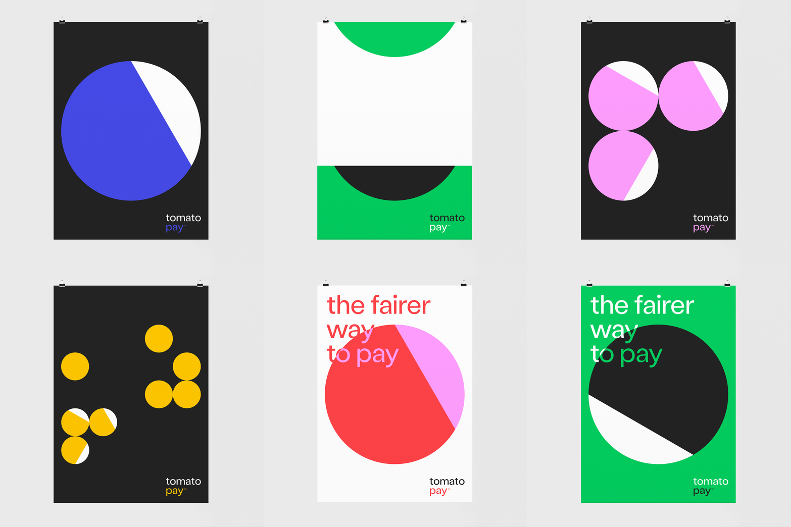
We’ve started to play around with the idea of zooming into the code, and reducing it to its most essential element, a dot. The dot can be interpreted as an abstract tomato, but it is also the starting point of a playful visual language that represents connections and transactions between people, banks and businesses.

The Tomatodots are a prominent asset within the brand: They are used in QR codes, in animations, as a key UI element in the product design, in campaign layouts and as a graphic element in stationery and other printed matters.

TOMATO_Poster_02.jpg
TOMATO_Poster_01.jpg